This page was generated from source/Jupyter/tutorials/tutorial-3-Plotting albedo values in one plot.ipynb.
Interactive online version:
![]() Slideshow:
Slideshow:
![]()
13.3.3. Plotting albedo values in one plot
Here you learn how to plot the albedo of two different days in one plot
First, some packages:
[1]:
# These packages are necessary later on. Load all the packages in one place for consistency
import numpy as np
import matplotlib.pyplot as plt
import pandas as pd
from pathlib import Path
import datetime
Read a data file and calculate albedos for all the data
[3]:
#The path of the directory where all AMF data are
path_dir = Path.cwd()/'data'/'1'
name_of_site = 'CA-Obs_clean.csv.gz'
path_data = path_dir/name_of_site
path_data.resolve()
df_data = pd.read_csv(path_data, index_col='time',parse_dates=['time'])
ser_alb=df_data['SWOUT']/df_data['SWIN']
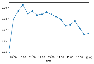
Plot the albedo of one day
[4]:
date1 = '2001 10 27'
ser_alb[ser_alb.between(0,1)&(df_data['SWIN']>5)].loc[date1].plot(marker='o')
[4]:
<matplotlib.axes._subplots.AxesSubplot at 0x1f959c23c88>
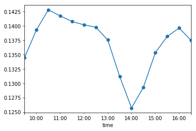
And another day
[5]:
date2 = '2001 11 21'
ser_alb[ser_alb.between(0,1)&(df_data['SWIN']>5)].loc[date2].plot(marker='o')
[5]:
<matplotlib.axes._subplots.AxesSubplot at 0x1f958793240>
Plot the albedo of both days on one plot using the previous methods
[6]:
date1 = '2001 10 21'
ser_alb[ser_alb.between(0,1)&(df_data['SWIN']>5)].loc[date1].plot(marker='o')
date2 = '2001 11 21'
ser_alb[ser_alb.between(0,1)&(df_data['SWIN']>5)].loc[date2].plot(marker='o')
[6]:
<matplotlib.axes._subplots.AxesSubplot at 0x1f9587ef198>
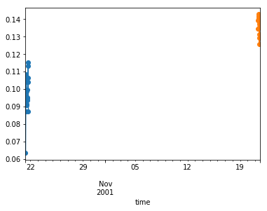
As the days are different, we do not get a good plot.
To fix this we need to find the time of the day each data point is associated with. For example, for date1, we use the time index from Dataframe.index.time :
[11]:
ser_alb[ser_alb.between(0,1)&(df_data['SWIN']>5)].loc[date1].index.time
[11]:
array([datetime.time(8, 30), datetime.time(9, 0), datetime.time(9, 30),
       datetime.time(10, 0), datetime.time(10, 30), datetime.time(11, 0),
       datetime.time(11, 30), datetime.time(12, 0), datetime.time(12, 30),
       datetime.time(13, 0), datetime.time(13, 30), datetime.time(14, 0),
       datetime.time(14, 30), datetime.time(15, 0), datetime.time(15, 30),
       datetime.time(16, 0), datetime.time(16, 30), datetime.time(17, 0),
       datetime.time(17, 30)], dtype=object)
Lets do this for both dates
[12]:
X1=ser_alb[ser_alb.between(0,1)&(df_data['SWIN']>5)].loc[date1].index.time
X2=ser_alb[ser_alb.between(0,1)&(df_data['SWIN']>5)].loc[date2].index.time
Y1=ser_alb[ser_alb.between(0,1)&(df_data['SWIN']>5)].loc[date1]
Y2=ser_alb[ser_alb.between(0,1)&(df_data['SWIN']>5)].loc[date2]
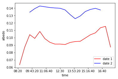
Now plot them in one figure
[13]:
plt.plot(X1,Y1,'r',label='date 1')
plt.plot(X2,Y2,'b',label='date 2')
plt.legend()
plt.ylabel('albedo')
[13]:
Text(0, 0.5, 'albedo')
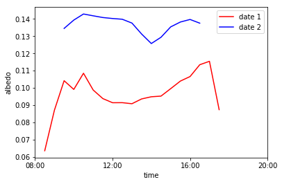
Much better! But the xticks are a little messy. We fix this by:
[14]:
plt.plot(X1,Y1,'r',label='date 1')
plt.plot(X2,Y2,'b',label='date 2')
plt.legend()
plt.ylabel('albedo')
plt.xticks([datetime.time(x, 0) for x in [8,12,16,20]])
[14]:
([<matplotlib.axis.XTick at 0x1f958b0cfd0>,
  <matplotlib.axis.XTick at 0x1f958b0c7f0>,
  <matplotlib.axis.XTick at 0x1f958b2db70>,
  <matplotlib.axis.XTick at 0x1f958b2de80>],
 <a list of 4 Text xticklabel objects>)