This page was generated from source/Jupyter/tutorials/tutorial-2-advance-plotting.ipynb.
Interactive online version:
![]() Slideshow:
Slideshow:
![]()
13.3.2. More plotting in Python
Some more advanced plotting in Python:
How to have multiple plots in one figure (subplots)
How to handle different axes in one figure
How to position legend
How to change x and y ticks
Loading necessary packages
[1]:
import numpy as np
import matplotlib.pyplot as plt
We want a figure with two horizontal subplots:
[2]:
fig,axs=plt.subplots(1,2,figsize=(15,3))
These figures have two axes (left and right). You can see this by printing the contents of axs:
[3]:
print(axs)
[<matplotlib.axes._subplots.AxesSubplot object at 0x000002BA219DBEB8>
 <matplotlib.axes._subplots.AxesSubplot object at 0x000002BA21CA0E10>]
Create some data to plot:
[4]:
x=np.arange(0,10,.1)
y1=np.sin(x)
y2=np.cos(x)
Plot them :
[5]:
fig,axs=plt.subplots(1,2,figsize=(15,3))

ax1=axs[0] #first axis (left one)
ax2=axs[1] #second axis (right one)

ax1.plot(x,y1,color='r',label='left axis')
ax1.legend()

ax2.plot(x,y2,color='b',label='right axis')
ax2.legend()
[5]:
<matplotlib.legend.Legend at 0x2ba21db06a0>
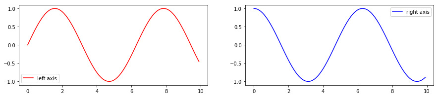
It is easy to define which axis you want to plot, and everything is similar to single plots (almost everything, you see later on why). Now Let’s have more subplots:
[6]:
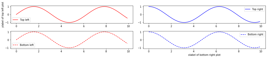
fig,axs=plt.subplots(2,2,figsize=(15,3))

ax11=axs[0][0] # Top left
ax12=axs[0][1] # Top right
ax21=axs[1][0] # Bottom left
ax22=axs[1][1] # Bottom right

ax11.plot(x,y1,color='r',label='Top left')
ax11.legend()
ax11.set_ylabel('ylabel of top left plot')

ax12.plot(x,y2,color='b',label='Top right')
ax12.legend()


ax21.plot(x,y1,color='r',linestyle='--',label='Bottom left')
ax21.legend()

ax22.plot(x,y2,color='b',linestyle='--',label='Bottom right')
ax22.legend()
ax22.set_xlabel('xlabel of bottom right plot')
[6]:
Text(0.5, 0, 'xlabel of bottom right plot')
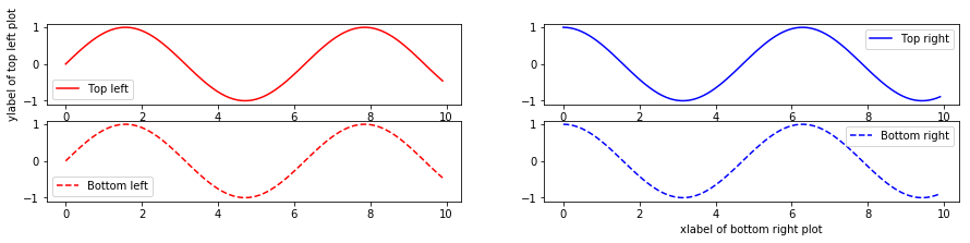
Important note:
In contrast to single plots, when you set a property for the plot, you use set_{keyword}.
For example:
in single plot: plt.xlabel('your xlabel')
in subplots plot: ax.set_xlabel('your xlabel')
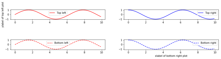
To modify the sub-plot postion we use: plt.tight_layout()
[7]:
fig,axs=plt.subplots(2,2,figsize=(15,3))
plt.tight_layout()

ax11=axs[0][0] # Top left
ax12=axs[0][1] # Top right
ax21=axs[1][0] # Bottom left
ax22=axs[1][1] # Bottom right

ax11.plot(x,y1,color='r',label='Top left')
ax11.legend()
ax11.set_ylabel('ylabel of top left plot')

ax12.plot(x,y2,color='b',label='Top right')
ax12.legend()


ax21.plot(x,y1,color='r',linestyle='--',label='Bottom left')
ax21.legend()

ax22.plot(x,y2,color='b',linestyle='--',label='Bottom right')
ax22.legend()
ax22.set_xlabel('xlabel of bottom right plot')
[7]:
Text(0.5, 6.000000000000025, 'xlabel of bottom right plot')
To adjust the distance between the subplots, you should use: fig.subplots_adjust(hspace=)
For example:
[8]:
fig,axs=plt.subplots(2,2,figsize=(15,3))
fig.subplots_adjust(hspace=2)

ax11=axs[0][0] # Top left
ax12=axs[0][1] # Top right
ax21=axs[1][0] # Bottom left
ax22=axs[1][1] # Bottom right

ax11.plot(x,y1,color='r',label='Top left')
ax11.legend()
ax11.set_ylabel('ylabel of top left plot')

ax12.plot(x,y2,color='b',label='Top right')
ax12.legend()


ax21.plot(x,y1,color='r',linestyle='--',label='Bottom left')
ax21.legend()

ax22.plot(x,y2,color='b',linestyle='--',label='Bottom right')
ax22.legend()
ax22.set_xlabel('xlabel of bottom right plot')
[8]:
Text(0.5, 0, 'xlabel of bottom right plot')
You can change the position of legend using the keyword loc=. Possible values for this keyword:
best
upper right
upper left
lower left
lower right
right
center left
center right
lower center
upper center
center
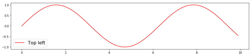
[9]:
fig,axs=plt.subplots(1,1,figsize=(15,3))
axs.plot(x,y1,color='r',label='Top left')
axs.legend(loc='lower left',fontsize=16)
[9]:
<matplotlib.legend.Legend at 0x2ba22269eb8>
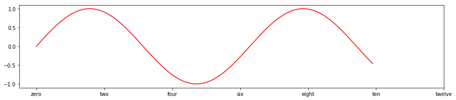
You can can customise x or y ticks using the following:
[10]:
fig,axs=plt.subplots(1,1,figsize=(15,3))
axs.plot(x,y1,color='r')
axs.set_xticks([0,2,4,6,8,10,12])

axs.set_xticklabels(['zero','two','four','six','eight','ten','twelve'])
[10]:
[Text(0, 0, 'zero'),
 Text(0, 0, 'two'),
 Text(0, 0, 'four'),
 Text(0, 0, 'six'),
 Text(0, 0, 'eight'),
 Text(0, 0, 'ten'),
 Text(0, 0, 'twelve')]